September 15, 2013

A Little Bling for My Birthday!

And when I say "bling", I mean the kind that lights up and hangs from the ceiling.  That's right, the ugly builder chandelier is gone!


Here was my dining room before...

And here it is now!

I am so happy!  I have been obsessing over this chandelier from Ballard Designs for years.  They must have known I had a painful big birthday coming up because they finally put it on sale for half price just for me!

I showed it to my husband and told him it was the only thing I wanted for my birthday.  It turns out that he was actually listening (okay, so I probably mentioned it more than once).  Not only did he listen, but he didn't procrastinate either.  Apparently it wasn't on sale for my birthday at all.  It was on sale because it was being discontinued.  He ordered just days before it was no longer available!

I love it way more than a sane person should probably love a light fixture, but it is so pretty!  You should see it at night.  It just sparkles!


My husband and kids gave it to me the morning of my birthday and we had it hung by noon.  Thank goodness my husband is handy and likes instant gratification as much as I do (and for the fact that the dining room table didn't collapse with both of us standing on it).  

After it was hung and we both looked to admire it, he admitted that he never understood why I hated the other light so much until he saw the new one hanging in its place.


So once again, just in case I wasn't clear... I absolutely love my new chandelier!!  Thanks to my sweet husband and awesome kids for making this birthday the best one yet. 


September 08, 2013

Sis's Room Reveal

Decorating my daughter's room was definitely a collaborative effort.  I think it is important for kids to be involved in decorating their own rooms.  I say this as if I had a choice in my particular situation.  It seems that Sis has inherited my need for creative expression and had lots of input.  I had ideas of what I wanted and she had ideas of her own.  We merged all of our ideas together and came up with a bright and cheerful room. 

It all started with the Pool Blue paint color from Sherwin Williams.  Sis picked it herself.  Well, actually she picked a much brighter version of what you see here.  I went up two shades on the paint card when purchasing the paint to tone it down a bit (she didn't even know the difference). 


After the paint color, the second biggest impact came from the new corner bed.  Because floor space is important in kids rooms, we pushed the bed into the corner.  I made two separate headboards out of plywood.  They were cut to size, covered in batting and fabric and then secured to the wall.  I made the bedskirt to match with left over fabric.


Because there is SO much color in the bed, I chose a plain white duvet cover.  Sis can't quite come to terms with the fact that it is white, but I just don't think the room could tolerate much else.  I made the navy fretwork pillows with fabric from Hobby Lobby.  

The shutters on the small window are actually functional.  They close to block out the light (and the creepy red eyes that sometimes peek in on her at night - so she tells me).  I made these when we first moved in about 7 years ago.  These odd little windows can be a challenge to cover.


The light up "B" is one of my favorite elements in the room.  I made this one for Sis and a "G" for little brother.  It was a weekend project (that took ALL weekend).  It is made out of MDF, strips of sheet metal and string lights.   (I do plan on posting exactly how I made it....one day...)


Other than what was mentioned above, we had everything else in the room.  It all took on a new life up against the blue paint. 

The little coat rack in the corner is perfect for hats and bags.  She has a bag addiction (also inherited).  It has been edited for the photo.  

The curtains are the LILL Sheers from Ikea.  They are my absolute favorite for little girls.  At only $4.99 a pair (YES, only $4.99 A PAIR), you can buy multiple sets to make them really full.  Here, I used 3 sets.  I should also mention that they come in 110" panels which means you can use them on the tallest of windows or drape them from the ceiling around a bed.  Because they are made of tulle, you can cut them to the size you need without needing a hem.

For a little punch of color, I added grosgrain ribbon in hot pink to match the existing chandelier.   


 We kept the walls fairly sparse with only a few key pieces.  Most of them were handmade or repurposed.  You can read about the canvas wrapping paper art here.


I loved working on this room with my sweet girl.  I look forward to more projects as a mother / daughter design team!


July 16, 2013

Quick Tip Tuesday - A Place for Hair Bows and Headbands

Any little girl mama's out there can probably relate to the massive amount of hair accessories that comes with having a daughter.  They usually end up everywhere and you can never find the one that you are looking for.

We have tried hanging bows from ribbons and shoving headbands into drawers only to be constantly frustrated.  That was until about a year ago when I finally found a solution that works for us!


An over the door shoe organizer now holds ALL of Sis's hair accessories and keeps them organized! The fact that this one is see through makes finding what we are looking for a breeze.  Everything is grouped together by color.  I think it actually looks kind of cute.  (Of course I would think that because I happen to love both organization and hair bows;). 


The fact that headbands actually fit in the pockets has literally solved all of our first world hair accessory problems.  I found this particular organizer at Wal-Mart.   You can find it here.


This has eliminated a huge stressor from our morning routine.  I hope it can work for you too!


July 06, 2013

Master Bedroom Reveal


There a couple of reasons that I love this room makeover so much.  The first reason is the wall color.  I am not one to shy away from color, but I was even a bit nervous about painting the entire room so dark.  I am so happy that I took the risk and went for it.  It is absolutely dreamy! 

The color is "Newburg Green" by Benjamin Moore.  It is a navy blue with a hint of teal.  My husband was totally down with going dark blue, but was adamant about not wanting anything green.   I was afraid that even mentioning the word green would turn him off despite how perfect the color was.   It happens all of the time.  People get very hung up on the name of the paint color versus the actual appearance of the color. 

In this case, the word "green" may or may not have been interchanged with the word "blue" when revealing the name of the color to him (it was for his own good).


The key to using dark or really bold colors is to balance it with plenty of neutrals.  In this room, I broke up the space with creamy bedding, light colored artwork and champagne curtains.  I raided my storage closet and brought most of these items out of retirement.  This leads me to the second reason that I love this makeover so much.  With the exception of buying a few accessories, I either already owned what is in the room or I made it.  The paint color made a huge impact on its own so the cost of the transformation was minimal.

One of the new to me items in the room is the bench at the foot of the bed. I found it on Craigslist and gave it a fresh coat of Caramel Latte spray paint.  I talk more about that here.


All of the artwork in the room is DIY.  The crown pictures above the lamps were clip art images printed on scrapbook paper.  I already owned the frames.  I think they could be a tad bigger, but not bad for using what I had.


The LOVE letters are from Hobby Lobby.  Three of the letters are now Caramel Latte along with the bench.  The "O" was "Rubbed and Buffed" a soft silver color.  
Thanks Honey We're Home for the idea.  


The chair in the corner now sports a DIY slipcover made out of a drop cloth.  It is really soft and is the perfect neutral color.  I will share how I made it in an upcoming post.


I commissioned two up and coming artists for the pastel works in the corner.   Nobody does abstracts quite as well as these two.


Finally, here is how the room looked before:


And while I wish this photo wasn't so dark....here it is after:


With great risks comes great rewards.  I can't believe I ever second guessed the bold color.  The only problem now is that is really, really hard to get out of bed.  
It just might be a little too cozy and relaxing:)

July 01, 2013

Quick Tip Tuesday - Using Fabric Markers to Color Match


I scored these awesome Robert Allen's Khanjali fabric pillows at Homegoods last week.  All though they are not outdoor pillows, I knew that I had to have them for my back patio.


Unfortunately, they only had two pillows in this fabric and I didn't find any others that worked as coordinates.  I needed at least two more.  In addition to these two chairs, I also have a loveseat that needed a little pillow love too.

I went to Homegoods, TJ Maxx, Marshalls, Pier 1, Tuesday Morning, Target and World Market looking for coordinating pillows only to come out empty handed.  Yes, I really did go to all of those stores.  What is even more disturbing is that I visited multiple locations of some of them.   I admit it, I have a problem.  

Normally, when I can't find exactly what I am looking for at the stores, I just make it myself.  This time, I was completely unmotivated to sew anything.  Just when I thought I might have to resort to making pillows myself, I remembered the last time I was in Garden Ridge, they had a huge pillow department.  Yeah, they are pretty crappy quality, but I didn't care at this point.  I headed there and unlike the other 75 stores I searched, Garden Ridge did not disappoint.  I found these cute pillows in almost the exact colors of my Robert Allen pillows. Did I mention that they were on sale for $6??  


Looking at the pillows in the pictures, they look like they match just fine.   Most people would have been totally okay with them the way they were.  It seems that I have this color matching disorder.  I get fixated on colors not being "just right"  Every time I looked at the new pillows, I saw pale, smokey blue as opposed to the more vibrant turquoise that I was seeing in the original pillows.


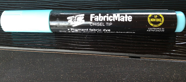
Nothing I buy or put in my house is above getting a little tweak or makeover.  I decided I would make the new pillows exactly the color I wanted using a turquoise fabric marker.


I basically scribbled over the blue flame stitch pattern until I got the vibrant color I was looking for.  Because the pattern wasn't perfect, I didn't have to be either.


Now the pillows look like this...

The marker is permanent fabric dye so it should hold up just fine.

Here they are on the loveseat.


And once again here is the fabric that started it all.


I love how the colors and patterns work together now.  I am sure that I will find more opportunities to use fabric markers.  This little trick will open up a ton of possibilities.  


June 30, 2013

Canvas Wrapping Paper Art - Easiest ever!


I was on a roll this past spring updating all of our bedrooms.  It started with my master bedroom, then Little Brother got a "big boy" room.  "Sis" (as he refers to her) was feeling a little left out so I ended up making some changes to her room as well.  I will post all of the room reveals soon.

One of my favorite things in Sis's room is her new corner headboard (you can see a sneak peek of it above).  The fabric is so busy that I was stumped as to what to do over the bed.  My original plan was to do a gallery wall similar to what she had in her room before.


But with this fabric....


It was just too much!

I needed to come up with something that fit Sis's personality (bright, fun, sweet), but was calming enough to balance the crazy fabric headboard.

While I was shopping for her birthday party supplies at Target, I stumbled across a super fun rainbow/water color wrapping paper.  I bought it to wrap her birthday presents because it was so "her".  
When I got home, I realized that the wrapping paper had all of the same bright colors as her headboard fabric.  I had an idea!  As I often shift gears in the middle of doing something, I stopped wrapping her presents and headed to my craft stash where I had a four pack of canvases that I bought on sale at Hobby Lobby.

I laid all four canvases together on the floor creating one large canvas.  Next, I rolled out my paper large enough to fill the entire area.


I decided that I would cut out a giant heart because it was the easiest thing I could think of.  I folded the paper in half and reverted back to elementary school Valentine's Day card making days.


After adhering the heart to the canvas with spray adhesive, I used an Exacto knife to cut through the heart using the canvas edges as a guide.

(Hello veins - yikes!!)


This created four separate canvases once again.  I liked where this was going, but it still needed something.  I taped off a 1/2 inch border and painted a navy blue frame around the edge including the sides of the canvases.

A couple coats of Modge Podge and here it is again... 


I love the way it coordinates with the fabric, but isn't too fussy.  It is also bright, fun and sweet just like Sis!

Other than waiting for the Modge Podge to dry, the whole process only took about 30 minutes and cost less than $15.  

Cheap and easy (insert joke here) - my favorite kind of project!