May 26, 2013

Dining Room Update

My dining room is the very first thing you see when you walk into our house.  I think we have the most open, open concept floor plan ever designed (that is not a good thing).   When you walk in, there is no entry way.  You walk slam into the dining room which is also open to the kitchen and living room.  Talk about pressure to keep things tidy.  I scramble every time the door bell rings to make it look presentable.  My house keeping skill is on display for all who enter to see.

It was equally important (if not more) to create a room that I loved walking into.  I really do love what I see when I come home from a hectic day.

Come on in and take a look....


Before I go into all of the details of how the room came together, I have to address the awful, builder grade chandelier. 


It is the one eye sore that you just have to ignore for now.  I haven't found exactly what I am looking for (super high end style) in my price range (super cheap).

Okay, look away and let's move on.

Years ago, I bought the table on Craigslist (go figure).   I also found this beauty there too.


I finally got up the nerve to attempt sewing a slipcover.  Here is how it turned out.


As with all of my sewing projects, DON'T LOOK TOO CLOSE!  I didn't take pictures of how I actually made it.  My brain power was being fully utilized figuring out the puzzle of piecing it all together.  Who knew you had to be so smart to sew!  My seam ripper was almost on fire with all of the redo's that took place.

**Quick side note...I did have to slip in a 3" piece of foam under the cushion to make it high enough to sit at the dining table.  

One of my favorite elements in the room is this DIY cornice board.  Not only because I love the way it turned out, but it was SO easy and relatively inexpensive.  


The velvet drapes from World Market looked so blahhh before.  I needed a little something to spice  them up.  When I came up with the idea of a cornice board, I ran out to the garage to see if we had anything I could use to make it.  Sure enough, there was a long piece of plywood left over from another project that was the perfect length.  My decorating angels were watching over me!  

As much as I would have liked to knock out the whole project and hang it up right then, I did have to collect some other materials first (fabric, batting and nailhead trim).  I will post a quick tutorial as soon as I locate all of the photos I took during the process.  


I did this quick and easy concentric paint treatment using painters tape and a gold glaze that I also had left over from another project.  It was a total spur of the moment kind of thing.  I just started taping and painting.  I am actually quite pleased with how it turned out.

I haven't decided what else I want to do with the niche as of right now.  I am thinking about glass shelves to create a bar area.  I think niches are such a pain.  I don't know why builders love them so much.  

Moving on...because the table is so large (it seats eight), I wanted to mix up the seating to keep it from looking like a conference table with matching chairs.


The bench was a wedding gift from Pottery Barn a million years ago.  The chairs are from World Market and we already talked about the settee.

I like the combination of textures and styles.  It is also very practical.  The bench gets used almost daily.  It is the perfect place to drop all of your crap when you walk in for homework, art projects and sewing. We do have an occasional meal there too.

All in all, I am happy with how the room turned out.  Hopefully, I will be posting about the perfect chandelier soon!


May 20, 2013

DIY Iron On Party Favors

I am just now recovering from my sweet girl's second slumber party celebrating her 8th birthday.  After weeks of bouncing around party ideas, she decided that she wanted to have a glow in the dark/neon/bowling/sleepover.  How can you top that?  It turned out to be a really easy (for me) and fun (for her) party.  

We kicked off the par-tay at 6:00 p.m.  As the girls arrived, they snacked on these AWESOME cookies that my talented neighbor, Megan Lee made.  And yes, they taste as good as they look. 


Once all of the girls were here, Brooke passed out the party favors. 


Each girl's bag was filled with glow bracelets, glow necklaces and these personalized neon bowling shirts.  


Creating custom party favors and gifts is SO easy.  You can find iron on transfer paper at most craft stores.  I bought mine at Hobby Lobby.   I created my image using clip art on PowerPoint.  I am sure  there are probably better programs out there, but I am comfortable with PowerPoint.  

Once I was happy with the image, I duplicated it for each girl and simply changed the name.  I printed 2 images per sheet to make the most of the 5 sheets that came in the package.  Next, I cut out the designs and simply ironed them onto the shirts.

Here are the girls (and little brother) sporting their matching shirts at the bowling alley.

And here is how they looked under the black lights.


So fun!!

This isn't my first time to create party favors using iron on transfer paper.  

A couple of years ago (seems like yesterday), I made these aprons for the girl's to wear while making pancakes at our pancakes and pajamas party.

I ordered the aprons from Discount School Supply.  Again, I used PowerPoint, printed them out and ironed them on.  


Oh, I almost forgot about last year's sleepover.  I made each girl their own autograph pillowcase.  I literally just ran upstairs and grabbed this one out of the linen closet.  That is why it is a wrinkled mess.  The girls passed the pillowcases around and signed each others with fabric markers. 


I hope the girls liked the favors as much as I do.  Who knows what we will come up with for next year.


May 14, 2013

Quick Tip Tuesday - How to Hang Symmetrical Groupings

Hanging pictures or mirrors in groups can make a great impact.  It is one of my favorite ways to fill a large space without investing in one single piece.  


Pinterest
It also gives you the ability to incorporate many different colors and subject matters. 
Pinterest

Groupings can be hung vertically or horizontally.   Making sure they have equal spacing and are all hung straight and level can be a challenge.


Check out Cassie at Hi Sugarplum!'s perfectly hung grouping of travel photos.  She didn't even use a level!  Apparently, she has some crazy sixth sense for spacing. 
Hi Sugarplum!
So what about the rest of us?  There is always the option of measuring.  It is simple, you measure the width of the picture, divide it by 2, add how many inches apart you want them to be.....WHATEVER!!!!!!   Forget that math crap!

Here is a quick and easy tip to hang groupings straight every time.  
(This also works for hanging single pieces that have two hangers on the back).


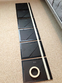
1.  Lay out the items to be hung face down in a straight line.  

2.  Adjust your spacing.   Be sure not to space items too far apart.  The grouping should read as a single unit.  I did about an inch here, but spacing really depends on the size of the pieces and the size of the area you are trying to fill.  


3.  Once you are happy with the layout, stretch a piece of masking tape across the whole grouping.  You want to start at the edge of the first piece and end at the edge of the last piece.  The tape should be applied directly on top of the hangers.  

4.  Next, draw a dot or punch a whole through the tape in the middle of the hanger.  This is where your nails will go.


5.  Carefully remove the tape from the pictures being sure not to tear it.  

6.  Stick the tape on the wall where you will want the pictures to hang.  Remember that the tape line is where the hangers will line up, not the top of the frames.  Make a mental note (or measure if you must) of the distance and allow for that distance above your tape line to the tops of the frames.

7.  Since your tape spanned the entire length of the grouping, you can center it on the wall as needed.  This is a good time to bust out the level.  It just so happens that my walls have horizontal stripes which made it easy for me.  

8.  The dots or holes that you punched on your tape are where to hammer your nails. Simply  hammer your nails right on top of the tape.


 8.  Once you have the nails in the wall, remove the tape and get to hanging.

If you are hanging multiple rows, you can reuse the tape ( being extra careful when removing it) over and over for all of the rows below. 


May 11, 2013

Boy's Basketball Room

Designing for kids (especially older kids) can be challenging.  Sometimes what they want in a room (lime green walls, monkey bars or everything to be zebra print) isn't always attractive practical.  At Nine Design Group, we recently got a call from a mom who wanted to make her 10 year old son's room a place he would not only love now, but one that he could easily grow into.

During the initial phone call with Mom, I uncovered some of the boy's wants and "needs".  One thing she told us was that he loved basketball.   In fact, he actually had a basketball goal in his room. 

With that information, the challenge became to make a basketball themed room that was sophisticated enough to carry him through his teenage years and would also be appealing to Mom.  The answer....keep the main walls a neutral gray (for Mom) and I would paint a feature wall to look like a giant basketball (for him).  

Together, we selected just the right color of orange for the basketball and carried it around the room with athletic inspired stripes.  (Sorry, I don't have pictures of the rest of the room.)  The thick black stripe is actually chalkboard paint (kids love it) where he and his friends can draw or write notes.   


I would love to act like I just whipped out this painting without much effort, but that was not the case.  It turned out to be one of those projects that once I started, I wondered if I had bit off more than I could chew.  It was MUCH more time consuming than I anticipated.  Mainly, because I am super picky about cutting in the lines.  There was no way to tape this one off because of all of the curves.  It was all by hand.  I spent HOURS touching up the edges with a tiny artists brush. 

My client and I laughed that I was like Eldin, the painter on Murphy Brown that came to paint and never left!


Well, I finally did finish just in time for the boy to get home from school....
(and do his homework, play some basketball, eat dinner and watch some TV).

The room was a big hit. His reaction when he saw the basketball wall..... "AWESOME!"  Mom was happy too!